29 Jun, 2010, KaVir wrote in the 2nd comment:
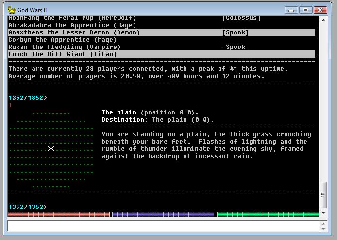
30-Apr-2010: I feel like a newbie again! However after a couple of weeks experimentation I manage to modify Nick Gammon's experience bar plugin so that it uses MSDP instead of the prompt, and draws three energy bars instead of one, representing health, mana and actions.

29 Jun, 2010, KaVir wrote in the 3rd comment:
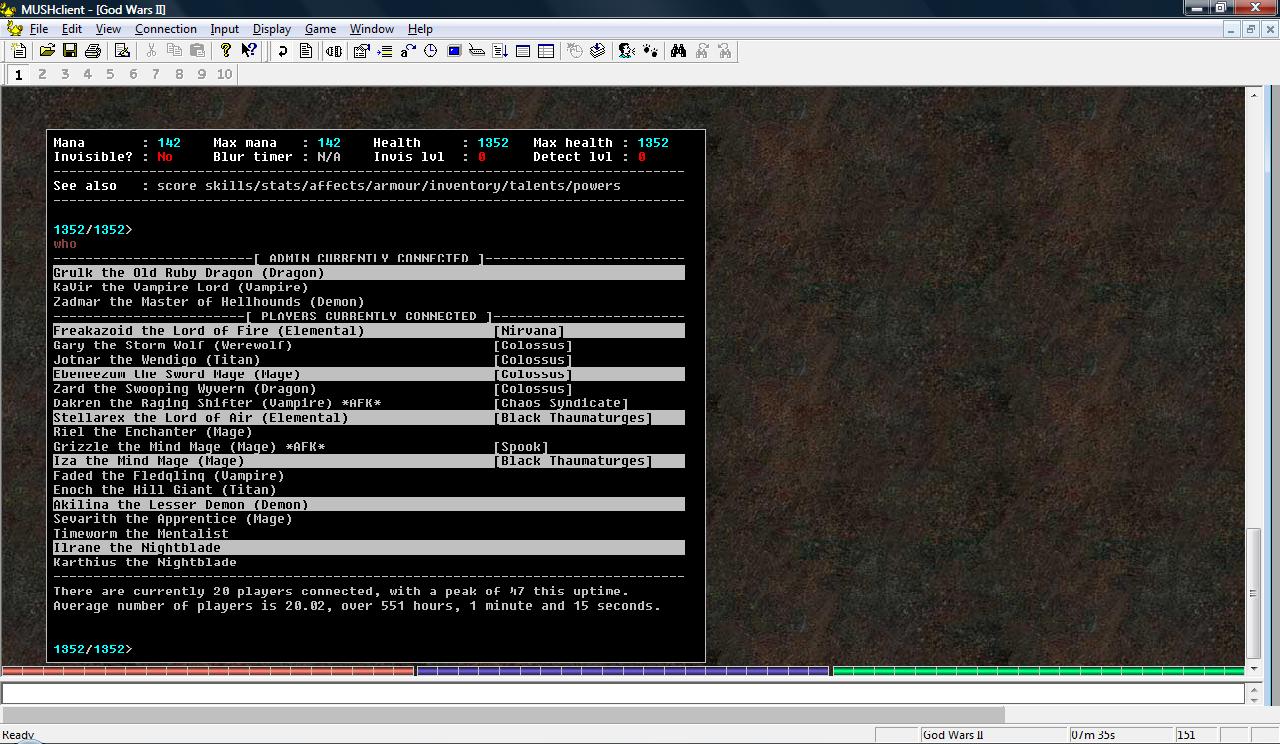
06-May-2010: After lots of reading, and some help from Nick on the MUSHclient forums, I manage to create my first simple graphical plugin - it reduces the size of the text window and adds a textured background.

29 Jun, 2010, KaVir wrote in the 4th comment:
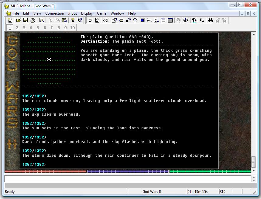
07-May-2010: Considered putting a title bar image across the top, but in the end I decided it was better with a taller text window. Added the title bar down the left side instead, and resized the text window accordingly.

29 Jun, 2010, KaVir wrote in the 5th comment:
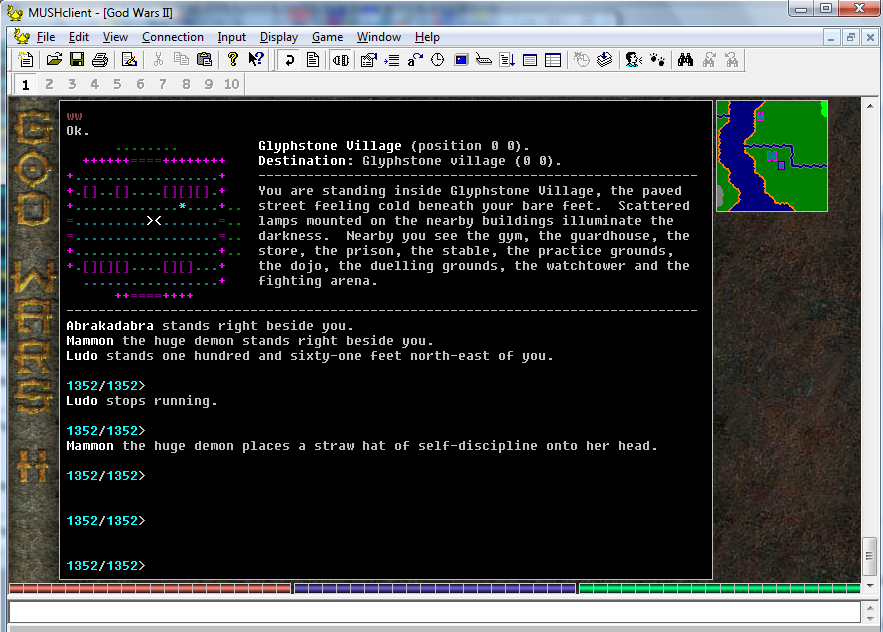
10-May-2010: Created a little map in the top right corner, assembled from 11x11 tiles. The tile set is generated by the mud from the current internal world data, using an admin command.

29 Jun, 2010, KaVir wrote in the 6th comment:
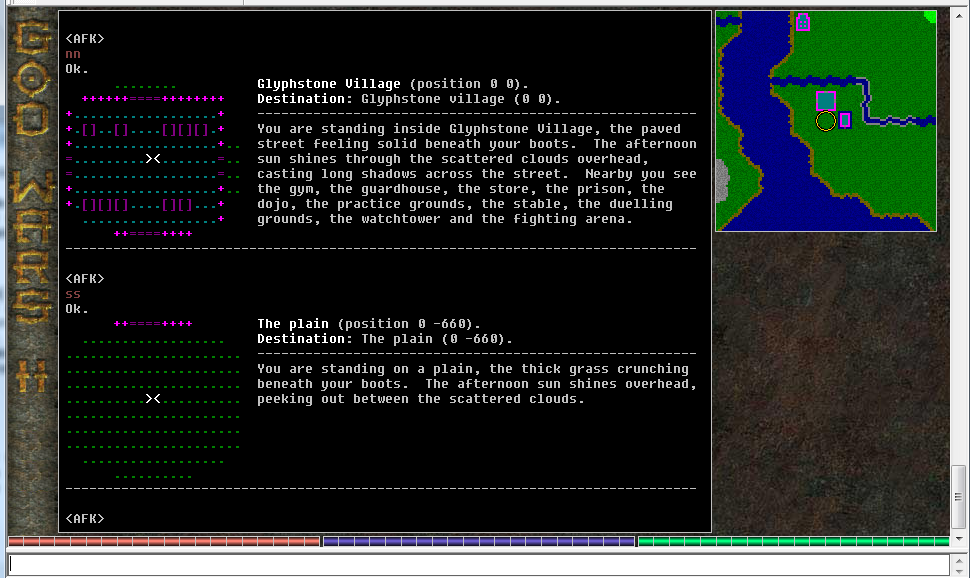
12-May-2010: Enlarged the tiles from 10x10 pixels to 20x20, with some randomisation of the colours to create a more textured appearance. Drew a circle in the centre of the map to represent your current position.

29 Jun, 2010, KaVir wrote in the 7th comment:
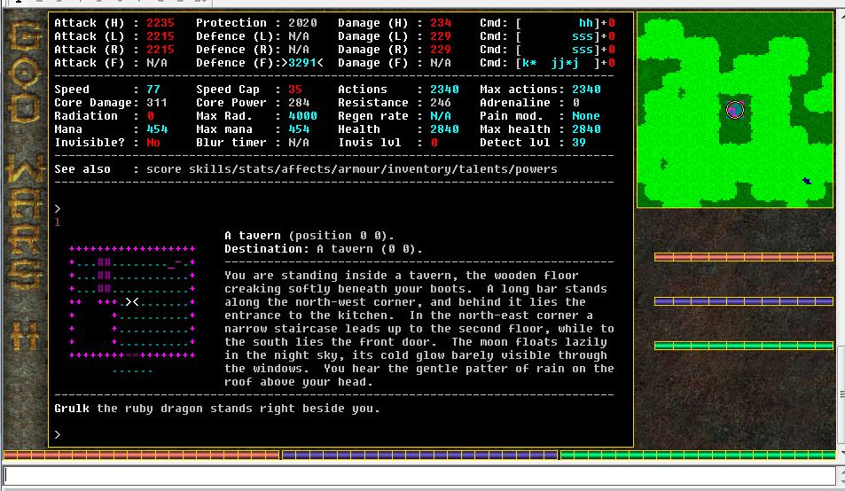
12-May-2010: Changed all the borders to gold, and dynamically resized the text window to full up as much space as possible (previously it was always 80 characters wide). Added some more energy bars underneath the map - I was considering moving them, but first wanted to see how it looked, so that I could compare the two.

29 Jun, 2010, KaVir wrote in the 8th comment:
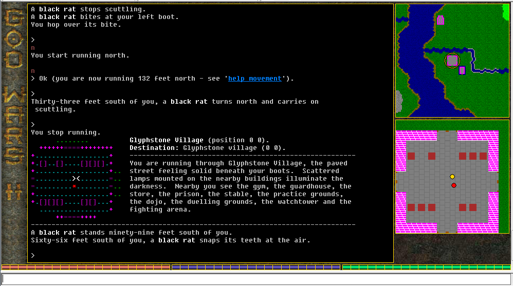
13-May-2010: Decided I preferred the energy bars at the bottom after all, so scrapped the other ones. Added a "look" scale map underneath the other map, showing mobs, objects, players and buildings.

29 Jun, 2010, KaVir wrote in the 9th comment:
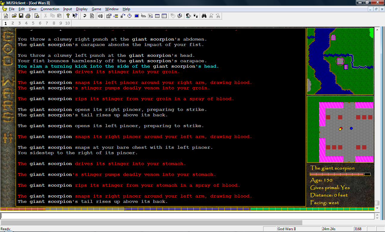
15-May-2010: Added information about your current target.

29 Jun, 2010, KaVir wrote in the 10th comment:
24-May-2010: Redesigned the energy bars to be positioned exactly under the text window, and included labels indicating what they represent along with the current numeric values. Changed the target info font to something less fancy but easier to read.

29 Jun, 2010, KaVir wrote in the 11th comment:
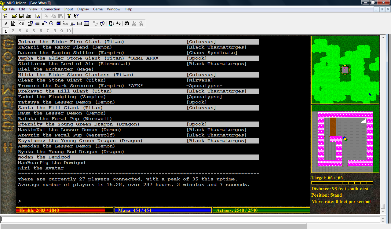
25-May-2010: Modified the tiles to make them a bit less blocky at the edges. It's not ideal by a long stretch, but I think it looks a bit better this way.

29 Jun, 2010, KaVir wrote in the 12th comment:
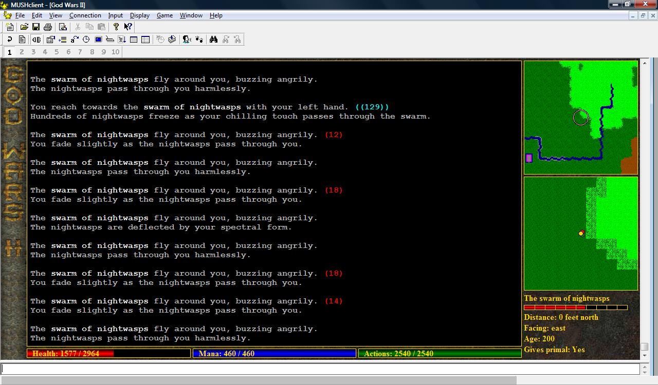
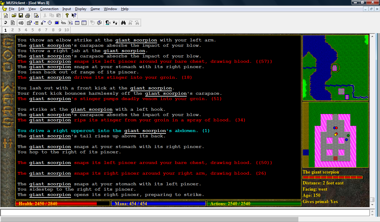
14-Jun-2010: Added MXP links to creature names, so that you can target creatures by clicking on their name.

29 Jun, 2010, KaVir wrote in the 13th comment:
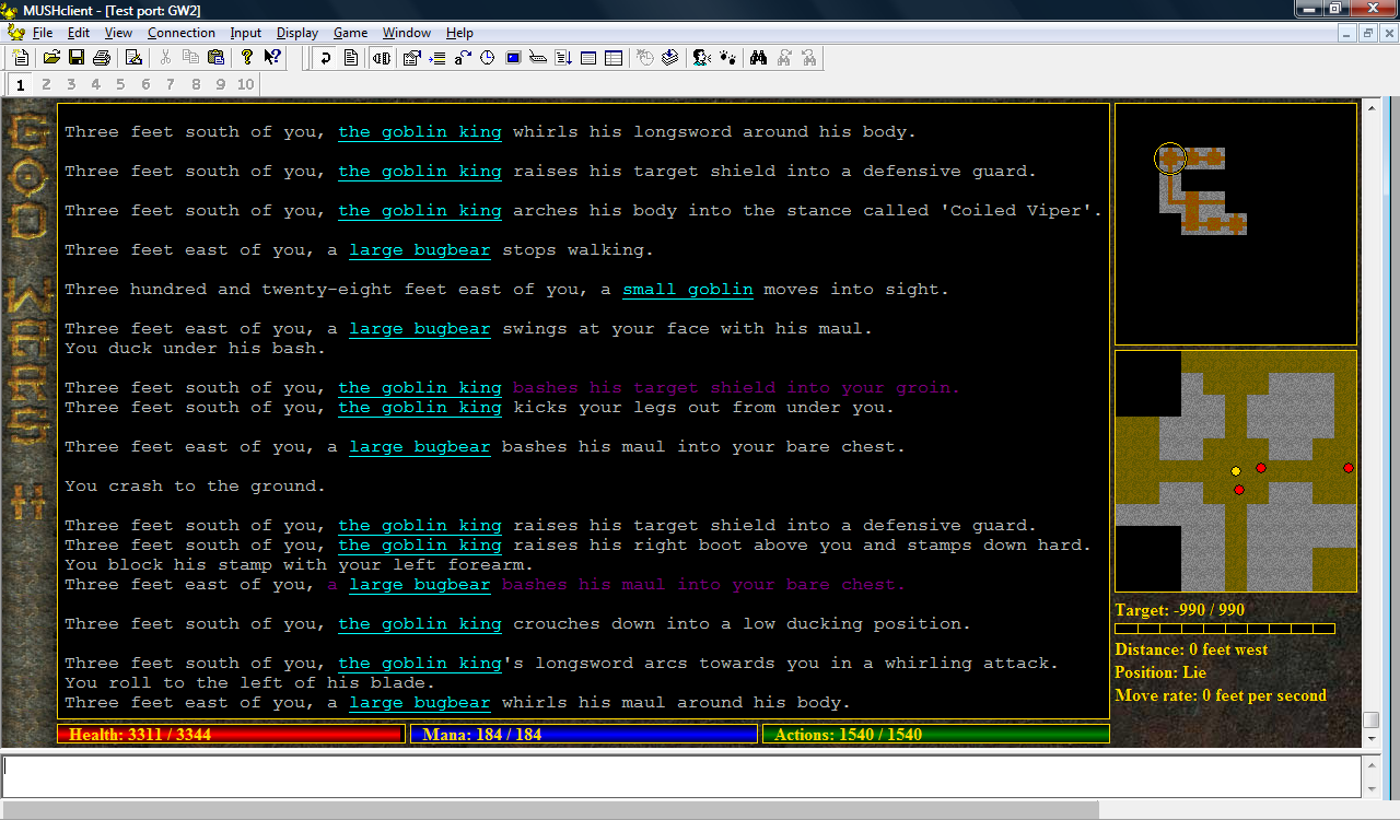
24-Jun-2010: Took a break from the plugin to work on the mud, but now I'm back! Created a new set of dungeon tiles. As the dungeon map fits exactly into the top map window there's no point in having it scroll around - so instead, the circle moves around while the map remains in place.

29 Jun, 2010, KaVir wrote in the 14th comment:
25-Jun-2010: Added support for xterm 256 colours, improved the way tiles are revealed as you move around, and added buttons to the maps which can be clicked to move in the specified direction - hovering over the button will indicate what it does.
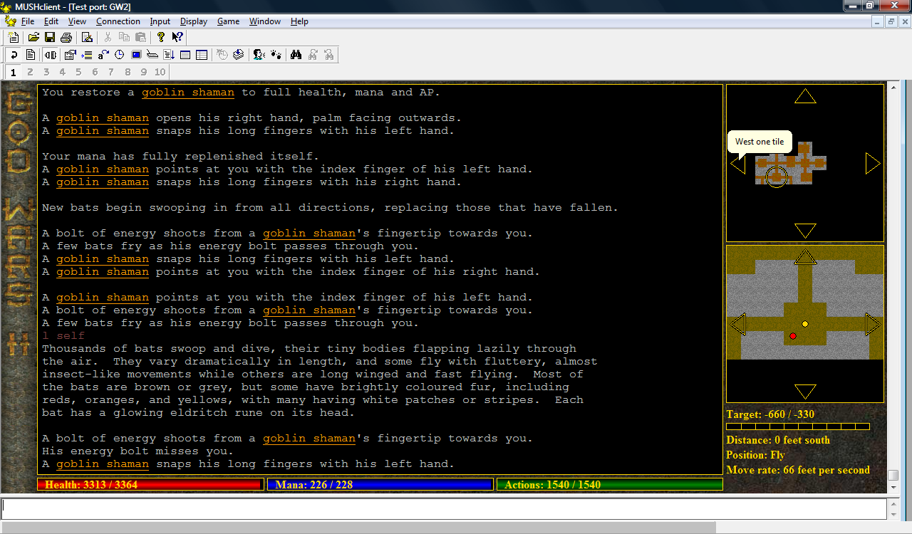

29 Jun, 2010, KaVir wrote in the 15th comment:
25-Jun-2010: Added a little avatar in the bottom left corner, and changed the circle in the top map to indicate your exact position instead of just your tile, so that it moves gradually instead of jumping 20 pixels at a time.
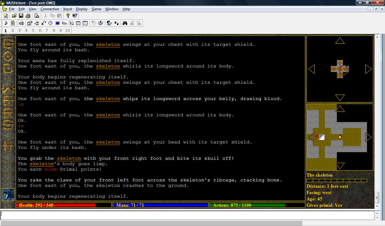

29 Jun, 2010, KaVir wrote in the 16th comment:
25-Jun-2010: Added an adrenaline timer below the avatar, and drew a black outline around the text on the energy bars to make it easier to read. Scrapped the arrow buttons - instead, you can simply click on either the top or bottom map to move to the location you clicked.
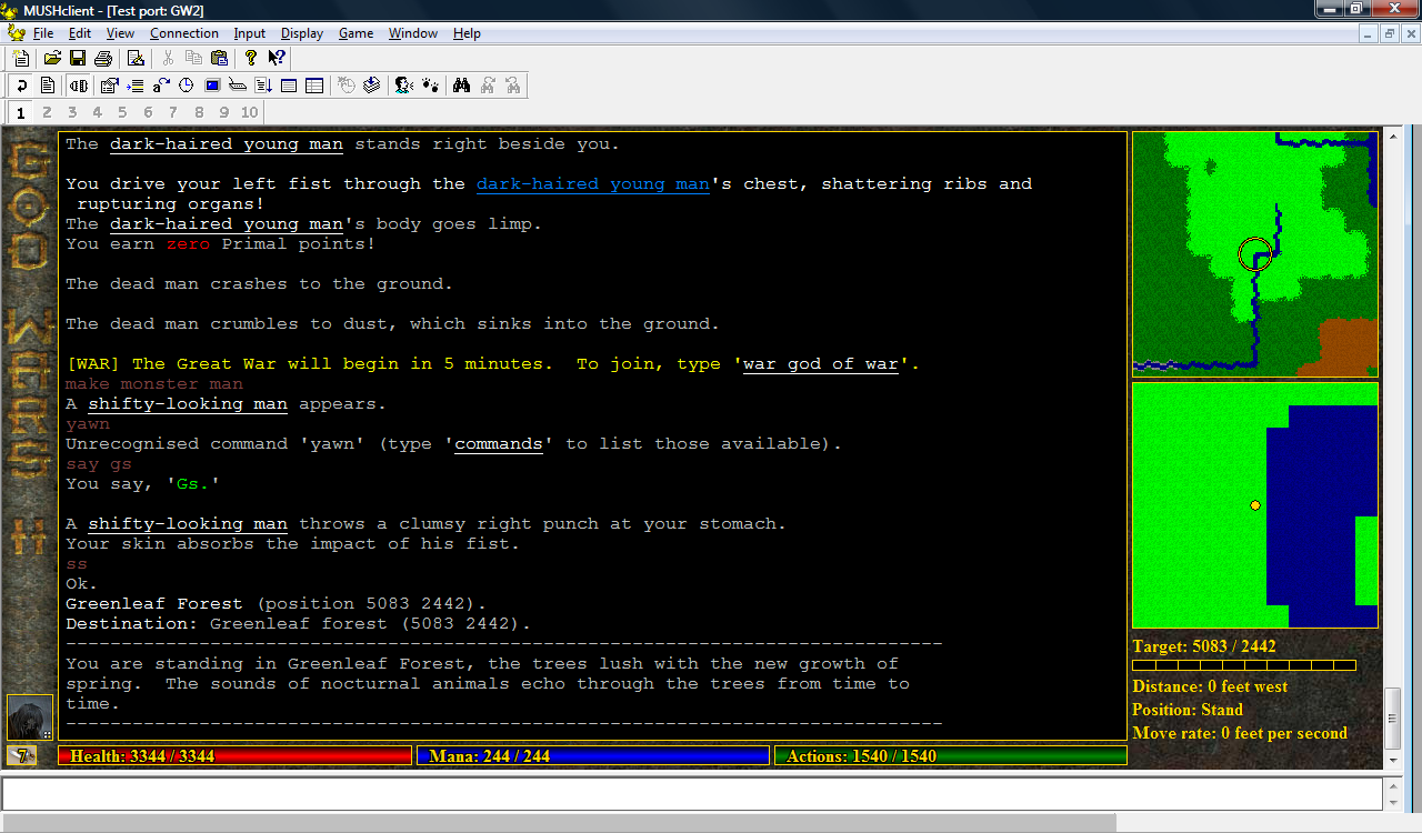

29 Jun, 2010, KaVir wrote in the 17th comment:
26-Jun-2010: Tied the avatars to shapechanging, so that they automatically change to reflect your current form. Added a heart icon to indicate your regen rate (empty, half, full). The plugin now reports its version number to the mud, making it easier to track which version players are using.
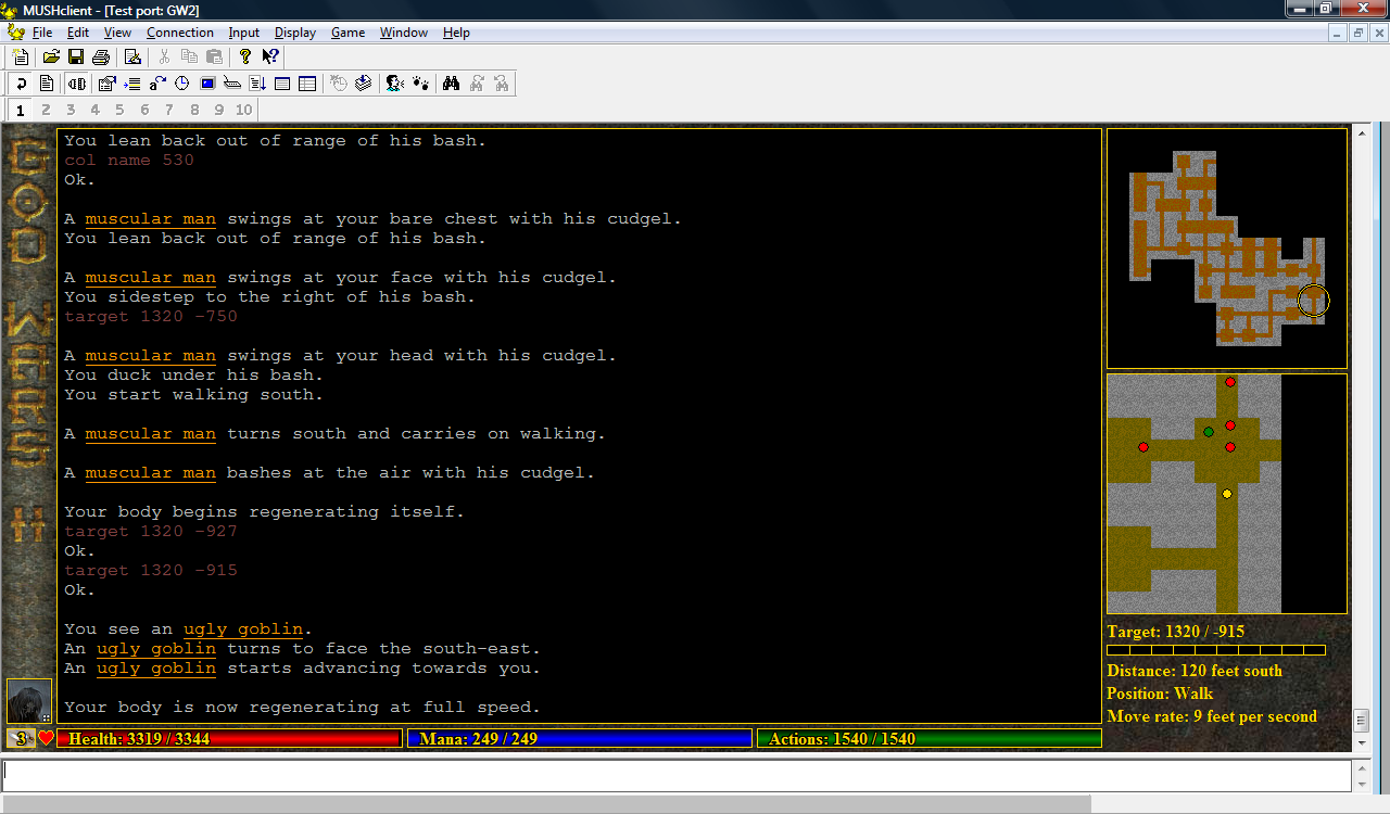

29 Jun, 2010, Runter wrote in the 18th comment:
I applaud this. It looks pretty fantastic so far.
29 Jun, 2010, Vladaar wrote in the 19th comment:
Great job Kavir, pretty impressive work.
29 Jun, 2010, Evan wrote in the 20th comment:
Looks great. I'd like to check your game out (been wanting to, but the website always overwhelms me with the amount of information there is to consume, and the class system is new to me. Old dog, new tricks etc.) and this might be what tips me over, when I have free time.
Random Picks

Last night I released another version of my MUSHclient plugin. It's still not quite finished, but I was looking back over my old screenshots and found it interesting to see how the plugin gradually took shape, and just how far it's come in a relatively short space of time. I thought I'd make a post about it here in case anyone else is considering doing something similar, showing a screenshot of the plugin at each stage.
A graphical interface is something I've wanted for my mud for quite a while, although I've always tended to dismiss it as something outside my area of expertise. Almost exactly a year ago I even made some early inquiries into creating some sort of graphical interface for MUSHclient, but I never really took it any further. It wasn't until two relatively recent posts on MudBytes that I finally got the ball rolling.
The first was on 15th March, when donky asked if I could detect which clie.... Prior to that point I'd never really looked into telnet negotiation (shameful I know!), but once I'd started playing with it I suddenly realised just how easy and useful it is.
The second was on 6th April, when Scandum recommended that I add support f.... At the time it was only intended for one of my players who wanted it for his TinTin++ scripts, but once I'd added it, I realised that it did exactly what I'd wanted to do with MUSHclient - and by 17th April I'd managed to create a basic MSDP plugin for MUSHclient.
3.5 months ago I didn't understand how telnet negotiation worked, I'd never programmed in Lua, and I'd never written a client plugin - and in the time since then I've only been working in spurts, at one point going a month without touching the plugin.
In other words: This ain't rocket science. It might appear intimidating at first, but MUSHclient does all the hard work for you - all you need to do is provide it with the images, pass it the data, and tell it what and where to draw. In fact one of my players has already designed his own plugin which offers even more functionality than mine.
So without further ado…