18 Apr, 2011, Runter wrote in the 41st comment:
Votes: 0
It's still a little too much height to fit on my screen. Maybe it should scale the height with the users input? I guess that's a problem since you use an image for the skin? You might consider breaking it into 3 parts so you can stretch the middle part for different heights. It's certainly going to be a problem on less impressive resolutions.
18 Apr, 2011, Twisol wrote in the 42nd comment:
You could use "position: fixed; top: 0; bottom: 0;" to lock the whole client's height to the viewport. Though that still has the image problems Runter mentioned.
18 Apr, 2011, Runter wrote in the 43rd comment:
I meant output, not input, on the last post but I couldn't edit it… so I'll add one more thing here to make it not useless. :p
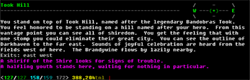
The more I think about it the more I'd suggest removing the skin completely. I'd localize each part of it if you still wanted it to look the same. This would fix other issues than the resizing problem. There's no reason, for example, that you should see the interface for your health bars, coins, map, etc etc at the splash screen. There's very likely to be times where you want to disable/change parts of the layout without being locked to a certain static skin.
The more I think about it the more I'd suggest removing the skin completely. I'd localize each part of it if you still wanted it to look the same. This would fix other issues than the resizing problem. There's no reason, for example, that you should see the interface for your health bars, coins, map, etc etc at the splash screen. There's very likely to be times where you want to disable/change parts of the layout without being locked to a certain static skin.
18 Apr, 2011, plamzi wrote in the 44th comment:
Runter said:
I meant output, not input, on the last post but I couldn't edit it… so I'll add one more thing here to make it not useless. :p
The more I think about it the more I'd suggest removing the skin completely. I'd localize each part of it if you still wanted it to look the same. This would fix other issues than the resizing problem. There's no reason, for example, that you should see the interface for your health bars, coins, map, etc etc at the splash screen. There's very likely to be times where you want to disable/change parts of the layout without being locked to a certain static skin.
The more I think about it the more I'd suggest removing the skin completely. I'd localize each part of it if you still wanted it to look the same. This would fix other issues than the resizing problem. There's no reason, for example, that you should see the interface for your health bars, coins, map, etc etc at the splash screen. There's very likely to be times where you want to disable/change parts of the layout without being locked to a certain static skin.
Removed the margins, but shortening the whole UI right will take more time. I don't want to give up precious text space and will probably end up redesigning the header.
As for making the UI more flexible, I'm totally with you there but that would depend on where I decide to go next. This started out as a Facebook-only app targeting people who are entirely new to mudding, so the decisions I made early on made sense at the time. I suspect every experienced mudder will soon want to move things around in a modular fashion but I wonder if I'll ever have the enthusiasm to turn this into an advanced web-based UI. For one, my mobile app performs so much better in attracting fresh blood that I'd rather focus efforts there. Also, I think among Facebook apps, MUDs with their fast-flowing text appear far too quaint, and it would take a whole lot of effort to design a true web-based GUI like the one I mocked up originally.
18 Apr, 2011, RoFAdmin wrote in the 45th comment:
Heya-
Not sure what ya changed, but now i dont get scroll bars for the browser at all, and its still to large for my screen so now i can reach the input box.
Not sure what ya changed, but now i dont get scroll bars for the browser at all, and its still to large for my screen so now i can reach the input box.
18 Apr, 2011, plamzi wrote in the 46th comment:
RoFAdmin said:
Heya-
Not sure what ya changed, but now i dont get scroll bars for the browser at all, and its still to large for my screen so now i can reach the input box.
Not sure what ya changed, but now i dont get scroll bars for the browser at all, and its still to large for my screen so now i can reach the input box.
Fixed after page refresh. My bad.
Random Picks