18 Jul, 2010, Scandum wrote in the 62nd comment:
What I'd do is get rid of the 11x11 and 121x121 map and instead put up a 33x33 map. Next get rid of the bar on the left allowing for a slightly bigger map on the right.
Then right under the map an icon of the target's generic type, human, dragon, arachnid, etc, with next to it the target's name, along the full length a bar with the target's health, and perhaps another bar with another important statistic. Under the health bar would be place for 7 or so affect icons with clock like shading for duration.
Under that and indented slightly at about 66 to 75% of the size would be your target's target. Under that is the player's info (100%), and indented and shrunk slightly the player's party, or otherwise notable creatures/players in the vicinity.
Some icons could be listed alongside the right side of the map or above it for links to the mud's message board, hyperlinked help files, a toggle for switching the map zoom, maybe an icon for a hyperlinked configuration menu, and other infrequently used important options.
18 Jul, 2010, KaVir wrote in the 63rd comment:
Scandum said:
What I'd do is get rid of the 11x11 and 121x121 map and instead put up a 33x33 map.
That's 1089 values. It's not really viable to send that much data as you're moving around, so it would need to build up the maps - either in advance or as you explored, with some sort of datestamp to indicate that the map had changed since you last explored it. You couldn't store the entire map though, it's too large…not sure how to get around that other than allowing the plugin to procedurally generate the maps in the same way as the mud.
If the zoomed map were also enlarged to 33x33 it would cover more than your character's line-of-sight, which means monsters and such would suddenly appear when they were a third of the way towards the centre…that would look pretty buggy. However changing that would be beyond the scope of a plugin - it would require changes to the game itself.
My intent here is really to showcase the sort of thing that anyone - player or admin - can produce for their own games, and discuss my thought processes along the way, to show the different stages I went through. Some people talk about graphical interfaces as if they're some sort of arcane magic, beyond the skills of mere mud developers, and that's a myth I'd like to dispel. This is probably a bit more difficult than adding snippets, but easier than most mud coding.
18 Jul, 2010, David Haley wrote in the 64th comment:
Re: scrollbars and distance meaning different things, this is already the case with all kinds of scrollbars in all kinds of places. Many games give you X pixels for health whether you have 50, 100 or 9000 health. Furthermore, if one spell lasted 30 seconds, and another spell lasted 10 minutes, are you truly going to have the longer spell bar be 20 times as long? The amount of space that would take on the screen would get silly pretty fast. As CB pointed out the human eye is quite good at guesstimating duration from a relatively quick glance at a decreasing bar. Couple that with the number of seconds (or whatever) left, displayed on top of the bar, and that should be all you need. Resizing the entire bar is not really workable, especially if we're truly talking about spells that last thousands of thousands of "ticks" vs. a normal time of a handful of "ticks" (what a "tick" is precisely doesn't matter at the moment).
This "myth" existed because for a long time, the server developer had no control over the client GUI whatsoever unless they were shipping their own client. Nick's miniwindows have changed everything in that regard: you still need a plugin, but that's a very small task compared to an entire client. But until server developers got that kind of control, it's really quite understandable that the GUI task was not really practicable.
KaVir said:
Some people talk about graphical interfaces as if they're some sort of arcane magic, beyond the skills of mere mud developers, and that's a myth I'd like to dispel.
This "myth" existed because for a long time, the server developer had no control over the client GUI whatsoever unless they were shipping their own client. Nick's miniwindows have changed everything in that regard: you still need a plugin, but that's a very small task compared to an entire client. But until server developers got that kind of control, it's really quite understandable that the GUI task was not really practicable.
18 Jul, 2010, Scandum wrote in the 65th comment:
You'd need a different level of compression, displaying tiles as 3x3 would do the trick as that'd result in a 9x9 grid. I think WoW provides 5 different zoom levels.
08 Aug, 2010, KaVir wrote in the 66th comment:
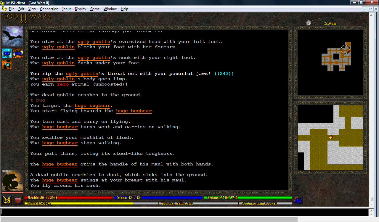
07-Aug-2010: I've changed the plugin to use a Lua table instead of GetVariable and SetVariable, and made it more robust in regard to missing images. The mud now sends icon IDs, so that each spell is displayed using a different icon, and I've started working on a "time of day" icon - a moving sun in the top right corner. I'm planning to have a moon as well, to indicate the time of night.
Mobs can now have their own icons, although I don't yet have many images to choose from. I may have to call on players to help provide some…this is the sort of thing that would be great to share between muds - a common repository of monster images.
Mobs can now have their own icons, although I don't yet have many images to choose from. I may have to call on players to help provide some…this is the sort of thing that would be great to share between muds - a common repository of monster images.
09 Aug, 2010, David Haley wrote in the 67th comment:
KaVir said:
I may have to call on players to help provide some…this is the sort of thing that would be great to share between muds - a common repository of monster images.
There are lots of free 2D tile sets available for isometric etc. games. You might want to google for "free 2d tile set" and see if anything fits your needs. Some are quite amateurish, many are (sometimes deliberately) only 8-bit pixels, but many are pretty good.
I agree, though, that it would be really quite nice if anything original produced were to be shared more or less freely.
09 Aug, 2010, Scandum wrote in the 68th comment:
KaVir said:
07-Aug-2010: I've changed the plugin to use a Lua table instead of GetVariable and SetVariable, and made it more robust in regard to missing images.
Interesting, have you looked into building a state machine to convert nested MSDP data into a lua table? I may have a look at it myself when I have time.
09 Aug, 2010, KaVir wrote in the 69th comment:
Scandum said:
Interesting, have you looked into building a state machine to convert nested MSDP data into a lua table?
No, I've not yet needed to. I'll need to change the format of my data at some point though - I've been putting it off because it'll break older plugins, so I want to make sure I change everything in one go.
28 Aug, 2010, KaVir wrote in the 70th comment:
28-Aug-2010: I decided to see what it would look like if I put a pretty border around the text window. I quite liked it, but it looked strange with the gold lines, so I removed them all. It makes the interface look darker, and I wasn't sure about it at first, but it's growing on me.
Without the gold borders, the energy bars looked wierd - just black rectangles. So I've tried putting darker coloured bars behind them rather than just leaving them blank.
I've also been adding more avatars. It's hard to find free hand-drawn images, but there are quite a few public domain photographs - I'm worried it may look inconsistent to mix the two, but I've decided to give it a go anyway, as I desparately need more images (the building avatar in this screenshot is a photograph). I also want to investigate using photoshop (or some other tool) to make the photographs appear like drawings.
29 Aug, 2010, KaVir wrote in the 71st comment:
I've just been having a play with an online photo to cartoon convertor, and IMO the results are actually pretty good:
This could prove to be the solution to my avatar problem - because while I suck at drawing and painting, I'm not bad at photography, and most of my family are pretty keen photographers as well. It also seems to be much easier to find public domain photographs than hand-drawn artwork.
This could prove to be the solution to my avatar problem - because while I suck at drawing and painting, I'm not bad at photography, and most of my family are pretty keen photographers as well. It also seems to be much easier to find public domain photographs than hand-drawn artwork.
29 Aug, 2010, Chris Bailey wrote in the 72nd comment:
Impressive. I think it looks pretty good =)
29 Aug, 2010, Rudha wrote in the 73rd comment:
That's incredibly shiny, for a mushclient GUI. I could never be arsed to figure the bloody thing out, to the point where I mangled a GUI into TinyFugue. :P
Maya/Rudha
Maya/Rudha
30 Aug, 2010, KaVir wrote in the 74th comment:
29-Aug-2010: Finally got the sunrise working (using the actual time - previously it was just using a dummy counter for drawing purposes). The original plan was that there would be a sun going from left to right during the day, and a moon at night - but this proved very fiddly, because days vary in length throughout the year. So in the end I decided just to have a full cycle (from left to right) represent a 24 hour period, from midnight to midnight, with the moon turning into a sun during the day and back to a moon at night. I also added the current time as a text label.
I've been creating more avatars from photos as well. Some work better than others, but I definitely think the cartoons fit the GUI better than photos. If other people decide to create their own GUIs, this would be a great way to built up a shared repository of images.
I've been creating more avatars from photos as well. Some work better than others, but I definitely think the cartoons fit the GUI better than photos. If other people decide to create their own GUIs, this would be a great way to built up a shared repository of images.
24 Sep, 2010, KaVir wrote in the 75th comment:
24-Sep-2010: I'm still not happy with the text in the bottom right corner, partly because I think it looks out of place with the rest of the GUI, and partly because it provides information about your target - which is displayed on the left side. I've been wondering if perhaps I could display the same information using little icons, displayed above or below the target icon.
The extra space I've freed up on the right means I can now draw borders around the two maps. I think this looks quite a bit nicer, although the right side now feels rather bare.
One problem is that the maps have a fixed size. Perhaps they could be resized, but I'm not sure how good they would look if I did that. But if they have a fixed size, I can't properly align them with the text window - otherwise I could just do that and perhaps add some extra icons underneath.
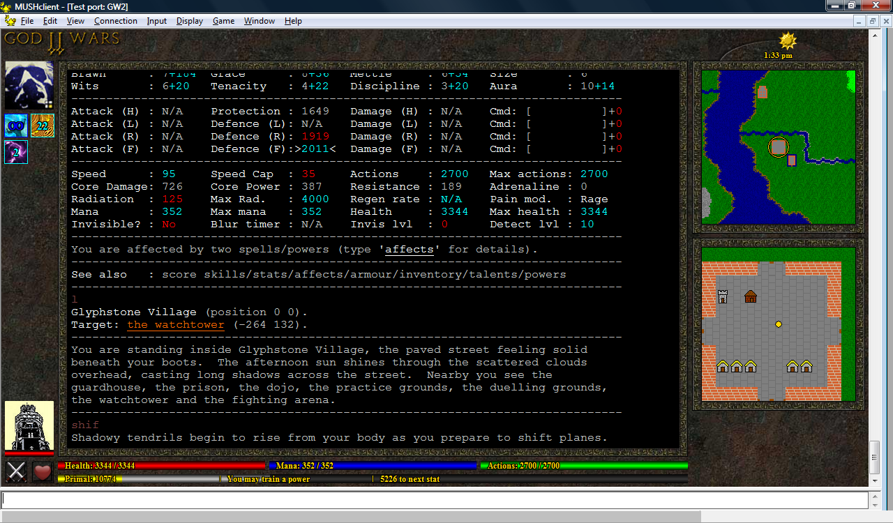
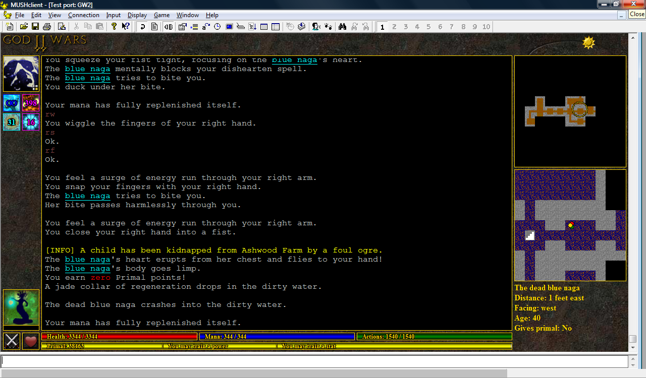
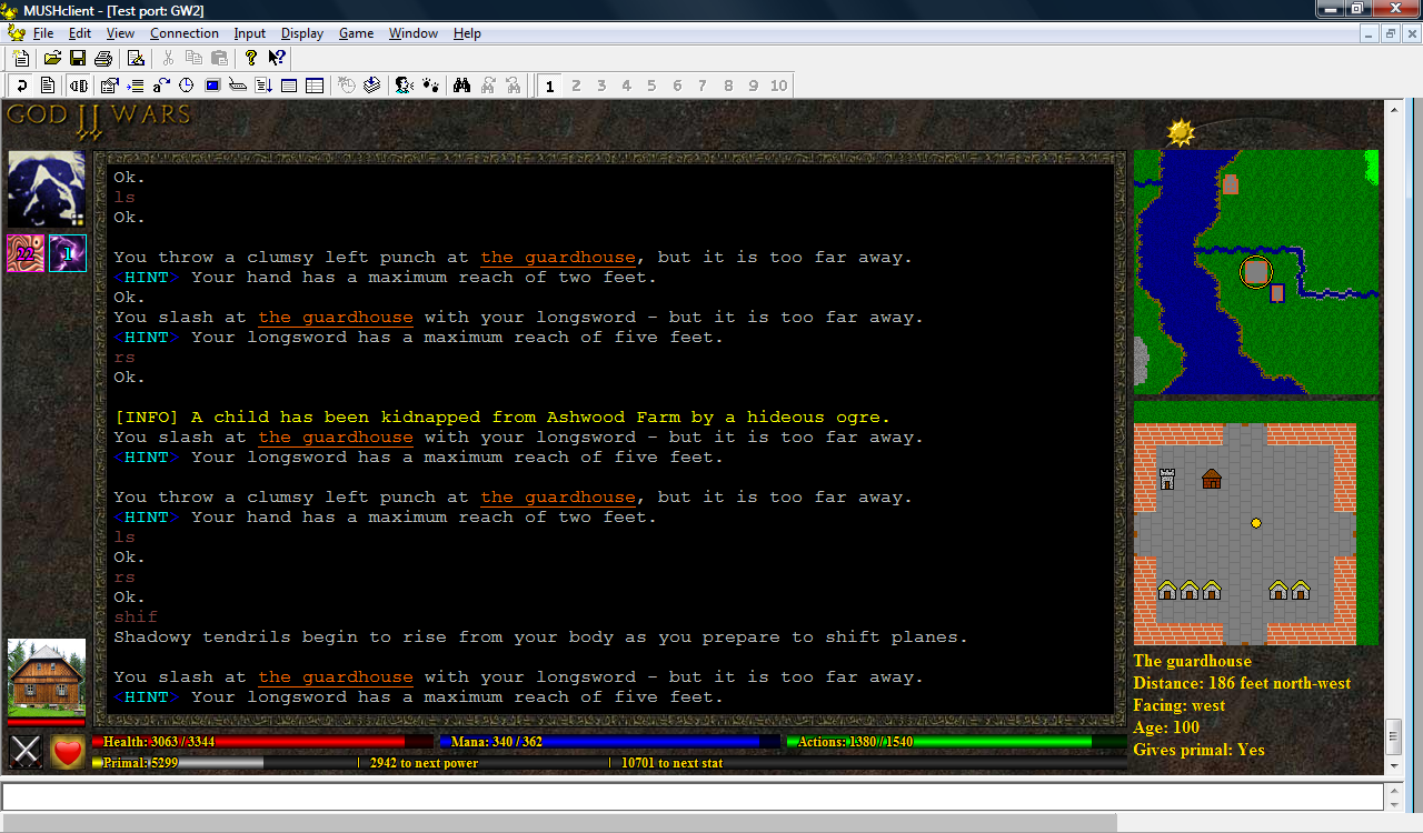
26 Sep, 2010, KaVir wrote in the 76th comment:
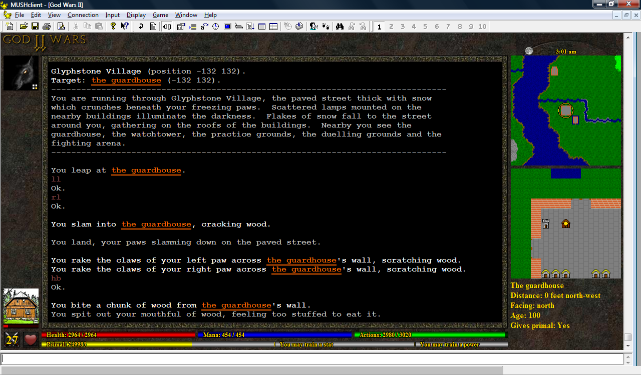
25-Sep-2010: I've decided I definitely prefer it without the text in the bottom right. I've added a little boot icon beside the actions bar to indicate your movement speed (you can't see the boot so well in this image because the movement speed is written over the top, but when you're standing still there's no text, so people shouldn't have trouble recognising what it is). The text shows your movement in feet per second, and is colour-coded to indicate the movement type (retreat, walk, jog, run or pounce).
The energy bar under your opponent on the left is now a salmon colour rather than red if the opponent is too weak to give a reward for killing it. There's also mouseover information telling you what age they are - so that covers at least some of the text. I'm trying to decide whether the other information is really vital, and if so, where it should go - perhaps more icons beside the boot? I also considered resizing the energy bars so that the boot could go below the text window (but then I'd have to do the same with the heart icon…and perhaps the crossed swords? Then I'd need to rearrange the enemy avatar…)
One of my admin has provided a large number of new avatars. She also mentioned that the spell affect icons looked out of place - so after some consideration I've decided to remove the borders around them. I wasn't sure about it at first, but after using it for a bit I think it looks better, now that the borders have been removed from everywhere else.
I've also cleaned up the sun/moon icon in the top right, which would vanish for several minutes at a time. It now always shows at least one pixel on one side or the other, and completes its cycle from left to right at midnight.
I'm still trying to decide what to do at the top. I'd originally thought of having bottons or tabs, but I wonder if that might look too cluttered. Most custom clients seem to have the title of the mud in a big fancy font at the top, and I always felt that was a waste of useful screen space, but I do wonder if it might look better for screenshots (which of course would help with advertising).
26 Sep, 2010, Rudha wrote in the 77th comment:
As a comment slash inquiry, you have a bit of screen real estate under the map: is there something that's going to go there or you plan to go there?
I think the interface looks pretty neat, incidentally.
Maya/Rudha
I think the interface looks pretty neat, incidentally.
Maya/Rudha
26 Sep, 2010, KaVir wrote in the 78th comment:
Rudha said:
As a comment slash inquiry, you have a bit of screen real estate under the map: is there something that's going to go there or you plan to go there?
That's where the gold text used to be. The problem is it's not always free space, it depends on the size of the client - the text window resizes, but the maps don't (and I'm not sure I really want them to). Since adding borders around the maps, there's even less space down there, so I'm not really sure what I could use it for.
26 Sep, 2010, Kline wrote in the 79th comment:
Still looking very nice. From a consistency standpoint do you have plans to standardize the text/size for the various icons? It seems the boot and crossed swords both have font to fill the entire icon while affects are smaller so you can still discern part of what the icon is easier.
26 Sep, 2010, KaVir wrote in the 80th comment:
Kline said:
From a consistency standpoint do you have plans to standardize the text/size for the various icons? It seems the boot and crossed swords both have font to fill the entire icon while affects are smaller so you can still discern part of what the icon is easier.
Hrm that's a good point. I added the crossed swords icon first, and only needed space for 2 digits - the spell affect icons can have 3 digits though, so I had to make the font smaller. But you're right, it looks a bit wonky, I'll change them to all be the same size. Thanks!
Random Picks

I already use mouseover to show the spell name. I could do the same with the duration, but as I've already had several players ask for exact timer information for certain spell affects (even prior to the plugin) I figure I might as well add it to the display.
It's all open source though, so if the players don't like it they can certainly remove the information, or use it to display a progress bar instead. Or maybe I'll have a play with the pie-shaped timer if I have the chance. It's pretty much an open ended thing, and I view my plugin as more of an example than a final product - something that might encourage other players and mud owners to create their own.