23 May, 2008, Tommi wrote in the 2nd comment:
I like it, its clean and easy on the eyes. it has my vote.
23 May, 2008, Asylumius wrote in the 3rd comment:
Other than perhaps making the links a darker color against the light gray, I'm a fan too.
23 May, 2008, kiasyn wrote in the 4th comment:
Asylumius: do you still have that banner you made for a skin we never finished? it was a bit shorter but wider and darker, I want to see how it would look on this skin.
23 May, 2008, Asylumius wrote in the 5th comment:
Um.. maybe! I'll look when I get home from work. If so, it would be in a psd file somewhere.
23 May, 2008, kiasyn wrote in the 6th comment:
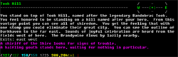
posting this here because i can't connect kiasyn.com to upload it atm, lol, will edit later.
quick preview of how threads may look - it feels a bit bare atm. the top / bottom links would be changed to the arrows you see… the time of the post isnt displayed anywhere which is a problem, but any suggestions / comments / constructive criticism.. just fire away
quick preview of how threads may look - it feels a bit bare atm. the top / bottom links would be changed to the arrows you see… the time of the post isnt displayed anywhere which is a problem, but any suggestions / comments / constructive criticism.. just fire away
23 May, 2008, David Haley wrote in the 7th comment:
I like its simplicity. I'm not a fan of lots of colors, fancy borders, etc. So I like it. I agree about the links, which should probably be something other than the lightish orange, though. Also, the shade of blue clashes with the white a little bit. Maybe add some more blue to it to make it a more vibrant blue? Not necessarily a light color, just more blue proper.
23 May, 2008, Asylumius wrote in the 8th comment:
Here is a transparent background PNG of the header. I'll upload the (much larger) photoshop PSD to Mudbytes.net after work.
23 May, 2008, Guest wrote in the 9th comment:
Kiasyn, you've outdone yourself on this one. Though I'm no fan of bright white, what you've got here looks like a winner to me. The light orange links look ok to me.
23 May, 2008, Brinson wrote in the 10th comment:
Its a really nice and professional template.
That said I also really like the current skin. Its more "gamey" to me (is that a word?). I don't know. One is professional and clean, and the other is cool.
The weird thing is…when I first came to this site..I HATED the current theme (there is a post somewhere of me saying so), but its grown on me…
Haha, I'm sentimental over a damn forum theme!
emote shoots self in the head.
Edit: Oh, and by the way, If this becomes the theme, I'm going to TOTALLY have to make a new avatar and signature…I totally designed them to match…
23 May, 2008, kiasyn wrote in the 11th comment:
DavidHaley said:
I like its simplicity. I'm not a fan of lots of colors, fancy borders, etc. So I like it. I agree about the links, which should probably be something other than the lightish orange, though. Also, the shade of blue clashes with the white a little bit. Maybe add some more blue to it to make it a more vibrant blue? Not necessarily a light color, just more blue proper.
which shade of blue with which white? lol
23 May, 2008, David Haley wrote in the 12th comment:
The top- and bottom-most blue with the main white background. I think the gradients on the sides are good. The links on the main white aren't too bad but the yellow/orange looks kind of funky on the blue-to-grey gradient on top. :wink:
Random Picks
Update: Moved to http://www.kiasyn.com/new_skin.png due to it stretching the page funky